
Project Overview
This project was developed during my semester-long Human-Computer Interaction (HCI) course, where the focus was on applying principles of user-centered design, iterative prototyping, and heuristic evaluation. The challenge was deeply relevant: reducing loneliness and increasing a sense of belonging among college students at Northeastern University. Working alongside my partners, Maya Robie and Layla Sheikh, we developed reMind. This mobile application is designed to combat loneliness by enabling loved ones to schedule, or "future-gift," messages for flexible and consistent emotional support.
The Problem
The core problem reMind addresses is the emotional disconnection and loneliness experienced by college students who are geographically distant from their home support systems.
Why is this an important problem to address?
Loneliness remains a critical issue on college campuses impacting student well-being. Reports including the Healthy Minds Study from the Healthy Minds Network and A Call for Campus Action from Active Minds and TimelyCare revealed the following key findings:
Loneliness is High and Persistent: While national data shows encouraging overall trends, more than half of students (52%) reported feeling high levels of loneliness. This rate has decreased from 58% in 2022 but still highlights a widespread struggle with feeling connected.
Loneliness Leads to Distress: Loneliness is one of the top predictors of psychological distress and negative mental health outcomes. College students who report feeling lonely are over 4 times more likely to experience severe psychological distress compared to those who do not.
Understanding the Users
Primary Stakeholders
We identified two primary user groups:
The Recipients (Northeastern Students): Primarily undergraduates (18–24) living away from home. They are tech-savvy but emotionally vulnerable to the "distance gap."
The Senders (Family & Friends): Busy individuals (parents, siblings, old friends) who want to show their loved ones they care but struggle with unpredictable schedules that prevent consistent communication.
Interviews & Observations
We conducted semi-structured interviews to understand how Northeastern students maintain connections during the transition to college. We found that staying connected to home is important to students and helps them not feel lonely. But maintaining long-distance relationships isn't always easy.
The Proximity Paradox: We found that students can be surrounded by people 24/7 but still feel isolated from their true support systems.
"It’s weird. I’m surrounded by people here 24/7, but it’s still the people I’ve known since birth that I’m actually missing. It’s hard to find that same deep connection with 'randos' on campus, and I’m constantly paranoid that while I'm away, I'm becoming 'out of sight, out of mind' to the people who actually know me best."
The "Busyness" Barrier: We observed that both students and their families want to talk, but the demanding nature of college life makes "real-time" communication difficult.
Between my classes and their work, it's really hard to find time. It’s not that I don’t want to talk. Keeping up with everyone back home feels like a second job sometimes. I need a way to feel that connection without the constant work of finding a time that works for everyone.
User Personas & Storybords
Based on our research, we developed storyboards and personas to represent our users' goals and frustrations.
Point of View (POV) Statement
We synthesized our findings into a single statement:
"We met Jordan, a first-year student who wants to stay connected to his parents even when life gets hectic. We were amazed to realize that the barrier isn't a lack of care, but busyness and forgetting. It would be game-changing to design a system that allows loved ones to 'future-gift' messages, giving students a reliable stream of support and a digital keepsake to revisit when they feel down."
Key User Findings & Insights
Asynchronous Over Instant: Real-time apps like FaceTime can be high-pressure. Users prefer "low-pressure" communication they can engage with on their own time.
The "Safety Net" Effect: Knowing a message will arrive reduces the "out of sight, out of mind" anxiety.
Sentimental Storage: Students don't just want to read a message; they want to collect them. There is a high demand for a "digital scrapbook" feature to revisit during low moments.
Frictionless Sending: For senders, the app must be "low-effort." We realized we needed guided prompts and templates to help.
Design, Test, Repeat
Over five iterative rounds, we tested our ideas with eight students and family members. Moving from rough paper sketches to a polished digital interface, we let user feedback lead the way—refining every interaction until the app felt less like a tool and more like a bridge to home.
Lo-Fi Paper Prototypes
We started with low-fidelity paper prototypes to map out our core tasks. By testing these "sketches" early, we identified and fixed major functionality and navigation hurdles before getting into the visual design.
Feedback & Revisions:
The "Icon Confusion" Gap: We discovered that users didn't always share our associations with certain icons. For instance, the "Collection" icon was often misinterpreted, leading us to add clear text labels.
Navigation Dead-Ends: Early testers often felt "trapped" on specific screens. We realized we hadn't accounted for all user paths, leading us to add Exit buttons on all popups and a clear Return to Home path after viewing notifications.
The "Next" Problem: Our initial message-scheduling flow featured a "Next" button that was too small and vaguely labeled, leaving users unsure of what happened to their data. We changed the buttons to have clear action verbs.
Removed "Analytics" Dashboard: No one wanted to decode a bar chart. We replaced complex graphs with sentence-based notifications that inform users about their top connections and people they haven't reached out in awhile.
Initial Hi-Fi Prototypes
As we transitioned to our high-fidelity prototype, we synthesized user feedback into these key design pivots:
The Scheduling Flow: Users felt lost in the process, so we added a visual stepper to show progress.
Safety & Error Prevention: To stop accidental losses, we added Confirmation Pop-ups for all destructive actions, ensuring no message is deleted by mistake.
Connecting to the Outside World: We realized "View and Respond" was too vague, so we created larger, buttons labeled "Open Message Details" to clarify when users are leaving the app.
Filter & Search Logic: The old filters were confusing; we built a multi-select system with friendlier naming so students can find specific memories without the guesswork.
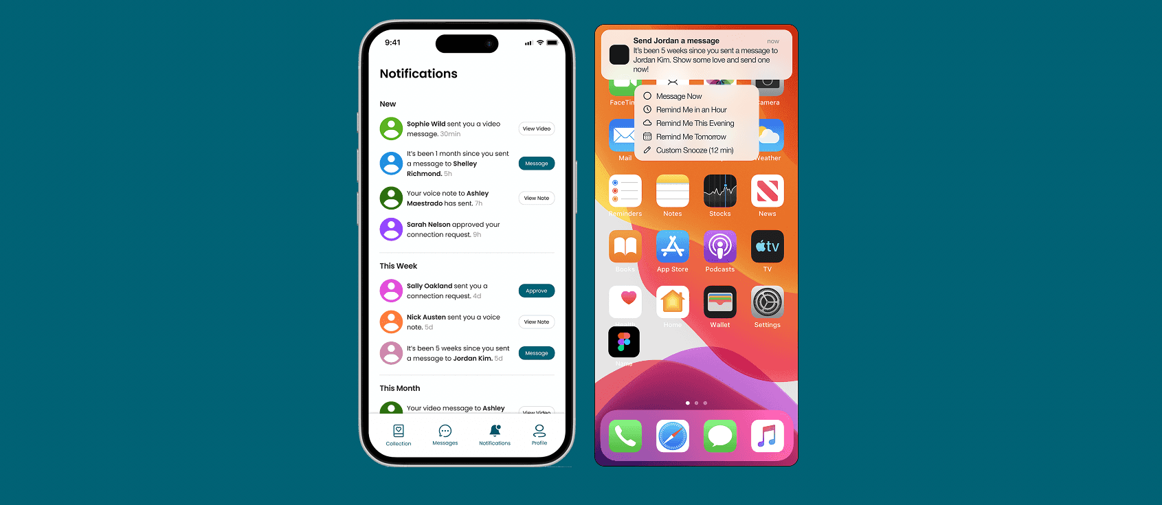
Custom Reminders: Because every student's schedule is different, we added Variable Snooze times, giving users total control over when they’re nudged to check in.
More Interface Refinements:
For our final prototype, we focused on:
Visual Accessibility: Increased all body text by +2px and added button states (hover, disabled, active) for immediate interactive feedback.
Authentic Content: Replaced all "Lorem Ipsum" with warm, realistic messages to help users visualize the app’s value as a digital scrapbook.
Enhanced Interactivity: Implemented dynamic date-pickers that auto-populate fields, reducing the manual effort for the sender.
Frictionless Design: Removed non-functional placeholder buttons and added a live word count for text entries to help senders manage their thoughts.
Polishing the Experience
Before finishing the design, we conducted a Heuristic Evaluation based on the "10 User Interface Rules" developed by design expert, Jakob Nielsen. Two evaluators tested the app to find any remaining friction points, grading issues from "minor" (1) to "major" (4).
From their evaluations, we fixed three Major issues:
Instant Feedback: Updated the code so that "liking" a message on the detail page immediately reflects on the main feed, ensuring the app always matches the user's actions (Visibility of System Status).
Human Language: Replaced confusing tech jargon like "Snooze" and "Reminder" with clearer labels and one-line descriptions (Match Between System and Real World).
Visual Legend : Created an "Interface Guide" in the Help menu to clearly explain the meaning of custom icons, like the heart and camera buttons (Help and Documentation).
The Final Designs
After weeks of iteration and testing, we built a full high-fidelity design and prototype. I primarily designed the Message Scheduling and Filtering flows.

Message Scheduling
Create, schedule, and edit messages (text, video, voice) for future delivery with prompt ideas
Past Messages Collection & Connect to Outside Apps
Browse and revisit past received messages anytime and options to respond to the sender outside the app via text or call
Customizable Profile and Settings
Ability to edit and update account settings, including notification frequency and snooze times
Notifications
Notifications for user interactions and reminders to send messages to loved ones they haven’t in a while
What I Learned
Building reMind taught me that the best design solutions come from listening, not assuming. My biggest lesson was the design truism "You Aren’t Your User." For example, we initially spent hours building complex data graphs, only to realize during testing that students found them confusing and unnecessary. This led us to pivot toward warm, sentence-based "Insights" that actually felt human.
I also learned the value of failing fast. Using low-fi paper prototypes allowed us to catch major navigation "dead-ends" and confusing buttons before we focused on complex visual design. However, looking back, I realized a significant gap: we mostly tested with tech-savvy students. If we were to start over, it would be good to bring in parents and grandparents. Since they are the ones "sending" the love, their feedback is vital to making sure the app is accessible for every generation. Ultimately, I learned that while distance is a logistical hurdle, staying connected is an emotional one, and a little bit of user feedback goes a long way in creating a product that is enjoyable and useful.